Designing Systems That Scale Teams
Every event we host is designed with intention, from the atmosphere we create to the way each session flows.
ATOMIC DESIGN
Design Systems
Designing a Layered Evaluation Framework for AI-Assisted Design
Reducing subjective feedback loops and preserving system integrity at scale.
Role & Scope
COMPANY
Athene
Expeditors
DA Davidson
T-Mobile
Baxley Commons
ETC.
ROLE
Lots of hats
Lead Designer
Co-Design
Product Designer
Workshop - Co-lead
OVERVIEW
PROCESS
User Research
Competitive Analysis
Wireframing
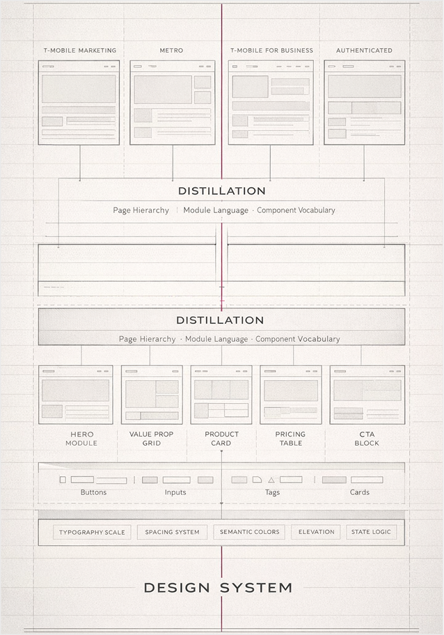
As product surfaces expanded across brands, structure did not. Multiple teams shipped across marketing, authenticated, and business experiences with inconsistent hierarchy, duplicated modules, and diverging visual patterns. The system evolved organically — without shared language or governance.
I was brought in to formalize that structure. What began as responsive page translation work evolved into cross-brand consolidation, module distillation, and component standardization across:
Marketing
Business
Authenticated experiences
Metro and adjacent entities
I audited page hierarchies, extracted recurring module patterns, and translated brand-specific implementations into a unified structural grammar.
This work became the foundation of a formal Design System practice — supporting 120+ designers and aligning design with CSS implementation at scale.
The objective was not visual uniformity.
It was architectural clarity.
THE CORE PROBLEM
As the ecosystem expanded, structural inconsistencies compounded.
The issues weren’t visual — they were architectural:
Page hierarchies varied across brands
Recurring modules were redesigned instead of reused
Component naming lacked shared taxonomy
Tool transitions (Sketch → XD → Figma) fragmented continuity
Design artifacts weren’t consistently aligned with CSS implementation
Rapid team growth outpaced governance structure
The result was duplication, drift, and rising implementation overhead.
Early Design System Learnings from CMS Responsive Websites.
Before formalizing a design system role, the foundation was built through production and responsive CMS work beginning around 2014.
Originally trained as a print designer, I transitioned into web as a production designer — working behind the scenes, preparing files, redlining layouts, and supporting developer handoff. This phase built deep familiarity with implementation realities and layout precision.
What began as a support function evolved into a structured process that informed every subsequent project.
Across CMS-driven platforms, I:
Designed desktop page systems
Translated full site architectures into responsive layouts
Redlined and documented implementation specifications
Normalized layout behavior across breakpoints
Identified recurring module and hierarchy patterns
Responsive compression revealed structural truth.
When pages collapse from desktop to mobile, hierarchy becomes exposed. Patterns either hold or break. Repetition becomes measurable.
Repeated across projects, this process became transferable. By the time I joined larger enterprise environments, system thinking was already embedded in the workflow.
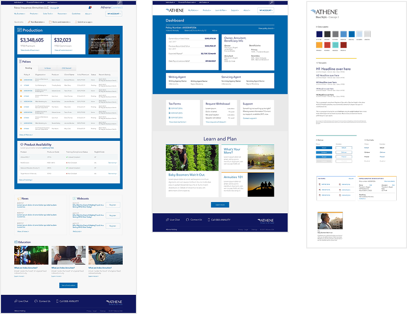
Athene component states (sample)
As Lead Designer on the Athene brand ecosystem, the work expanded from page layouts to full-system architecture.
The challenge was no longer individual screens.
It was governing complex, data-driven states across the entire product surface.
This included:
Designing modular page systems across marketing and authenticated experiences
Establishing repeatable grid and hierarchy patterns
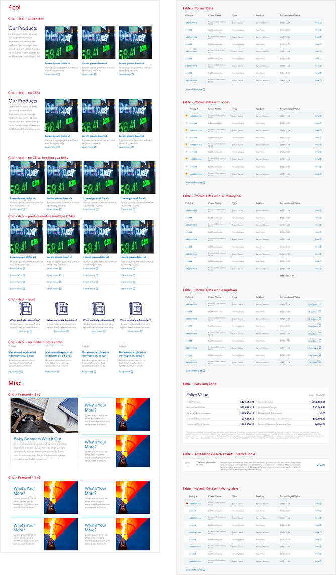
Defining table behaviors and state variations (normal, summary, expanded, error, policy alert)
Standardizing card, list, and featured content modules
Aligning UI states with real implementation logic
The complexity was structural:
Multiple grid configurations
Dynamic data tables
Conditional modules
Responsive breakpoints
Brand-level visual consistency
Each surface had to resolve through the same architectural logic. The objective was not aesthetic cohesion.
It was predictable behavior at scale. This phase marked the transition from page design to system governance — where structure, state modeling, and implementation alignment became primary.
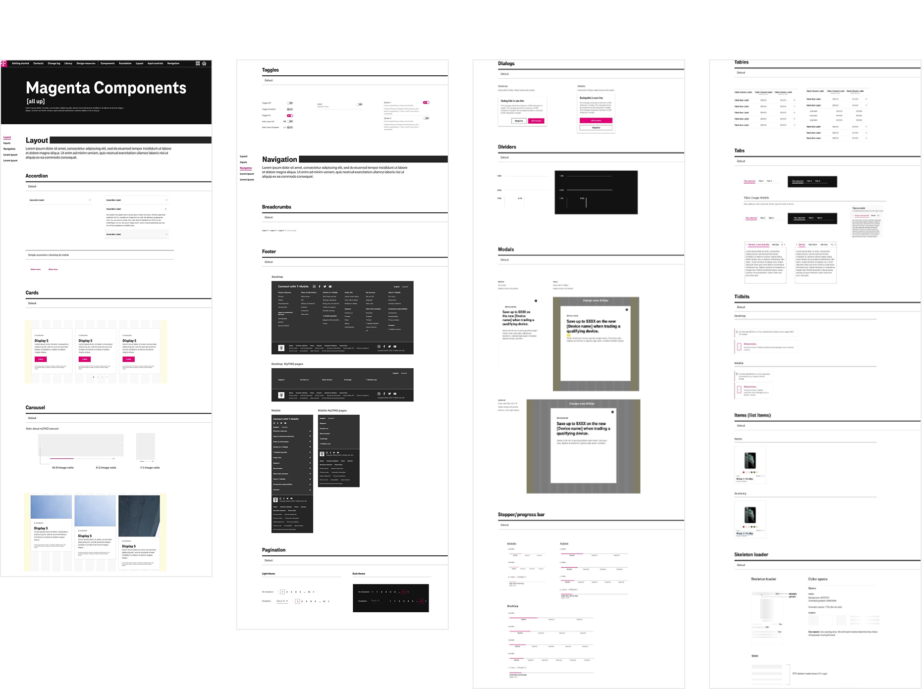
Atoms were defined as:
Typographic systems and scale logic
Spacing scales and grid frameworks
Reusable layout primitives
Shared interaction states
Tokenized color and theming foundations
Components were built from these atoms — never ad hoc. Each module resolved through documented structure before visual styling was applied.
The styleguide was not a visual catalog. It was a controlled vocabulary for design and implementation.
Formalization reduced redundancy, stabilized handoff, and created a shared architectural language across brands.
Case Studies — Applied System Validation
Success was not measured by visual similarity.
It was measured by structural consistency.
Outcomes included:
Reduced duplication
Predictable implementation patterns
Faster onboarding for new designers
Clear alignment between design and development
The system’s strength was not in isolated components.
It was in consistent architectural behavior across surfaces.
Atoms & Styleguide — Formalization
With structural principles defined, the next step was translating them into reusable components and tokens.
The objective was not visual polish. It was structural repeatability.
This required:
Separating structural invariants from brand expression
Locking shared layout primitives (grid, spacing, hierarchy)
Defining repeatable module anatomy
Formalizing component naming and taxonomy
Aligning design artifacts with CSS implementation
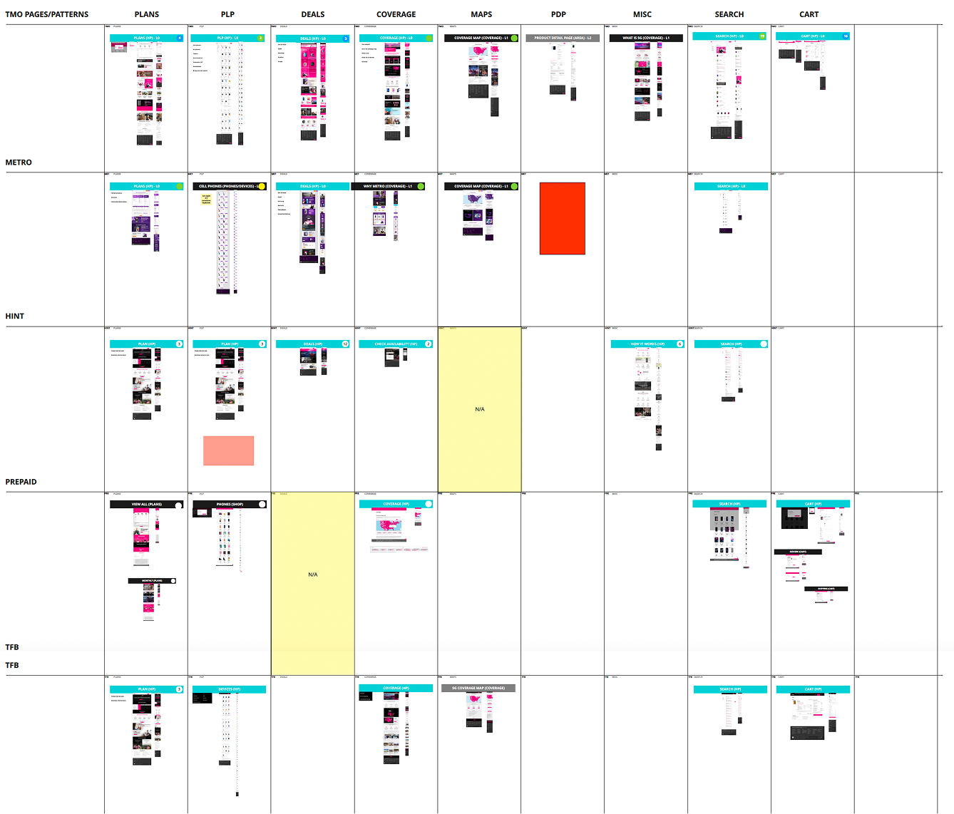
Cross-Brand Structural Audit
To move from observation to governance, I mapped structural parity across brands and platforms.
This matrix visualized:
Page types (Plans, PLP, Deals, Coverage, PDP, Search, Cart, etc.)
Brand implementations (TMO, Metro, HINT, Prepaid, TFB, Sprint)
Structural consistency vs. divergence
Redundancy, gaps, and pattern drift
Rather than redesigning surface-level components, the audit focused on hierarchy, module sequencing, and behavioral logic. The goal was architectural clarity — not visual alignment.
This framework clarified:
Which structures were invariant
Which modules could be consolidated
Where brand-specific variation was required
Where duplication created implementation overhead
The matrix became the foundation for module normalization and component consolidation across the ecosystem.
The system was validated through real implementation across high-traffic product surfaces.
The system was validated through real implementation across high-traffic product surfaces.
Representative applications included:
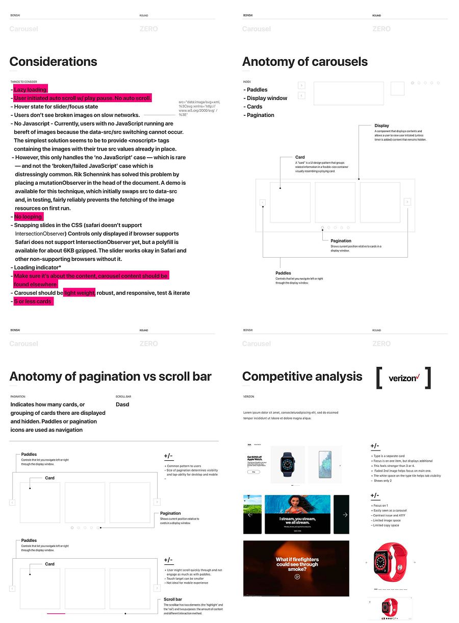
Carousel structure and interaction logic
Navigation and scroll behavior frameworks
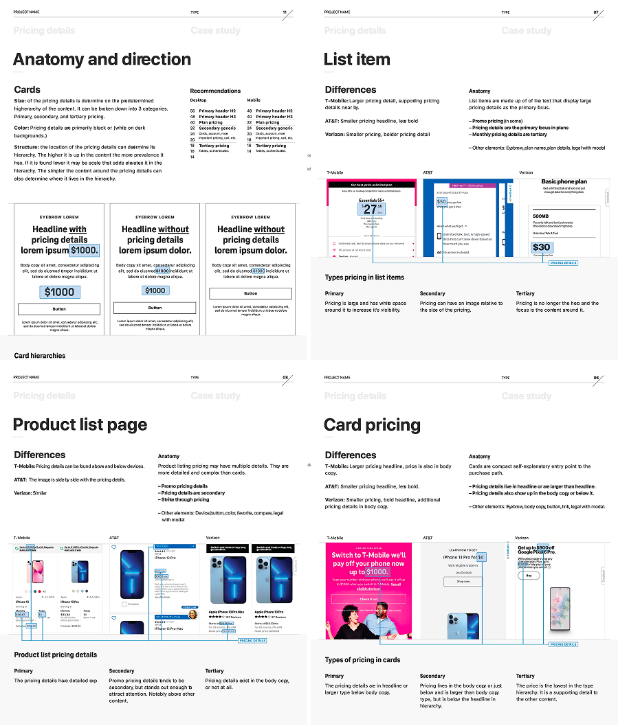
Pricing and comparison modules
Product Listing Page (PLP) architecture
Coverage and map hierarchy
Search and cart system alignment
Each case applied shared structural rules while adapting to brand context.
Casestudy samples
TOOL
UX
Accessibility
Development team
3rd Party Vendor
Project Management
THE GOAL
Introduce structural governance capable of scaling with the organization.
This required:
Establishing shared page hierarchy principles
Locking repeatable module patterns across brands
Formalizing a component taxonomy aligned with development
Separating structural invariants from brand expression
Creating education pathways to support team expansion
The system needed to be:
Stable under tool changes
Flexible across brands
Scalable across teams.
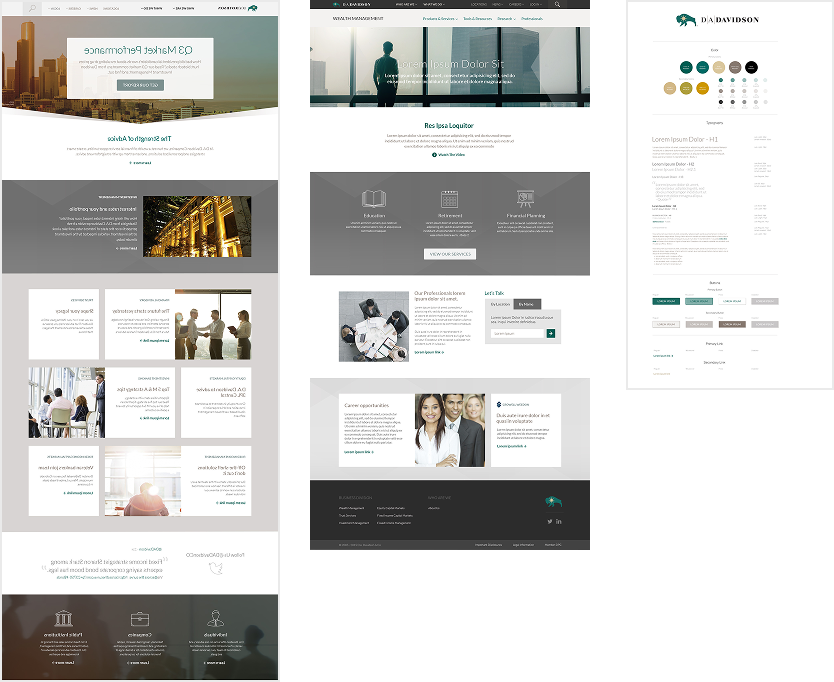
DA Davidson
Athene