CUSTOMER SUPPORT DASHBOARD T-MOBILE INTERNAL REPRESENTATIVES
CARE DASHBOARD | T-Mobile
Project Description
COMPANY
T-Mobile for Business
ROLE
Lead Designer
Product Designer
Workshop - Co-lead
OVERVIEW
PROCESS
User Research
Competitive Analysis
Wireframing
The Care organization relied on fragmented reporting tools that evolved without governance or alignment. Metrics were duplicated, dashboards varied by team, and effort often outweighed measurable impact.
This project focused on restructuring the analytics ecosystem into a modular, decision driven dashboard framework and shifting the experience from passive reporting to actionable insights.
CORE PROBLEM
Reporting evolved without system governance
No shared governance across reporting tools
Metrics lacked consistent definitions across teams
Dashboards varied significantly by team and use case
Visualization choices were inconsistent and preference-driven
Reporting effort was not tied to measurable outcomes
The system was optimized for presentation—not decision-making.
Workshops
This project began in early discovery to better understand Care team workflows, tools, and pain points.
We focused on how teams support customers, where breakdowns occur, and what information is critical during real-time interactions.
Through collaborative workshops, we evaluated existing tools, aligned on cross-functional needs, and identified gaps in current dashboard capabilities.
User Research
Stakeholder Interviews
Workflow Mapping
Competitive Analysis
Wireframing
THE GOAL
Creating a decision-driven dashboard system
Metrics lacked canonical definitions across teams
Visualization choices were inconsistent
Effort was not tied to measurable impact
Feedback loops were opinion-driven
The system optimized presentation — not decisions.
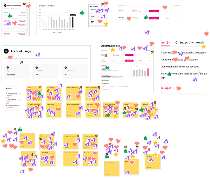
Card sorting Effort vs. Value
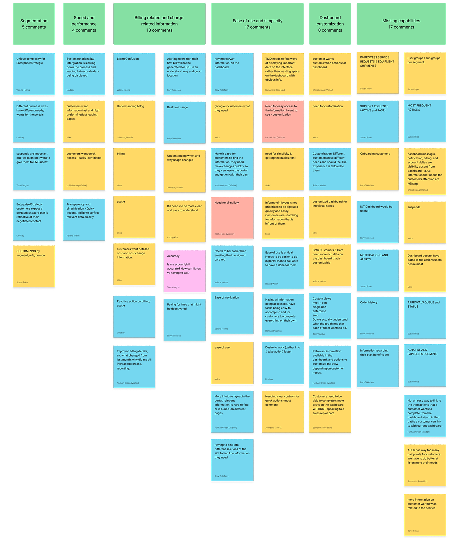
These sessions helped us move from scattered feedback to clear, prioritized opportunities.
Widget Audit & Gaps
As part of discovery, Care audited existing dashboard widgets to determine:
Which widgets supported their needs
Which were missing or incomplete
Opportunities for new or revised components
Special attention was given to collaboration features such as Notes:
Visibility and privacy controls
Sharing permissions
Cross-role accessibility
TEAM
UX/UI
Accessibility
Development team
3rd Party Vendor
Project Management
Business Owners
Voting on priorities
Workflow & Escalation Context
We explored:
How Care supports customers when they are blocked from achieving goals
Common issue resolution patterns
What information Care needs immediate access to during live interactions
Handoff notes for historical recording keeping for issues
Documentation and resolution of issues
Help for customer care agents to quickly access to resolve issues.
Process
Iteration: From Exploration to Convergence
During testing, we identified backend limitations with Salesforce that impacted performance and scalability. The API overhead and load time became an issue.
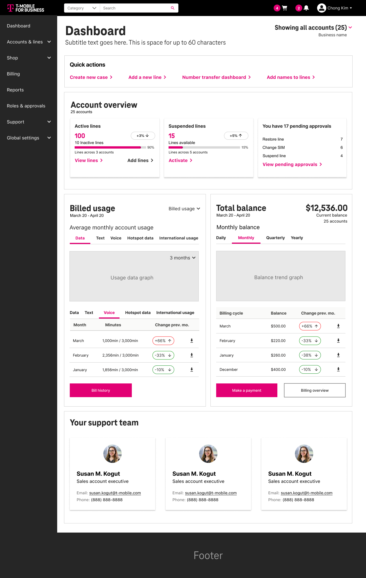
While the initial goal included customizable dashboards for multiple user types, we adapted the approach to prioritize speed and usability.
Instead of maintaining complex, customizable dashboards, we simplified the system by introducing focused landing pages for key workflows—improving performance and clarity.
This decision allowed us to move forward quickly while still delivering a more usable and scalable experience.
These insights and constraints shaped how we approached the system moving forward.
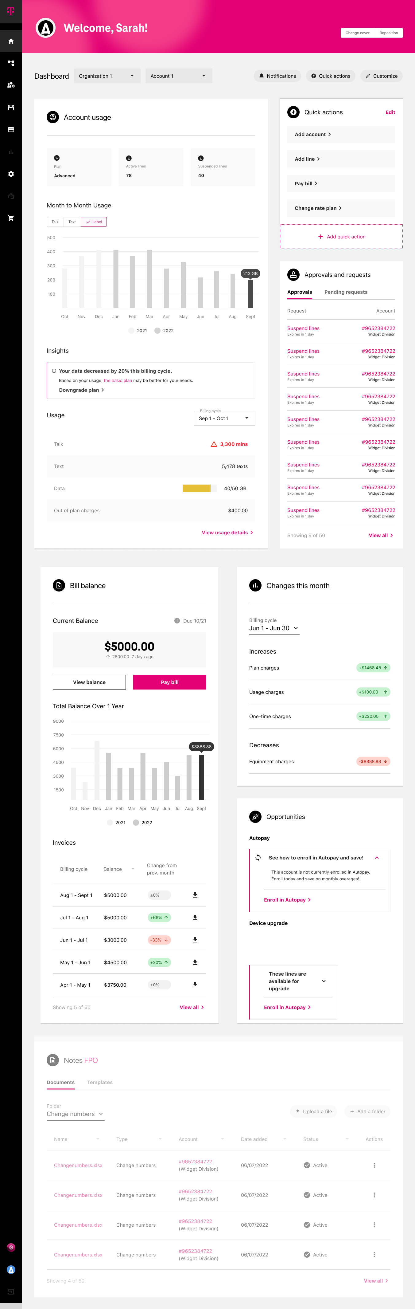
Round 6 comp
What changed between round 5 & 6
The back end of Salesforce could not handle the data API ingestion and was lagging the site. So instead of have 4 customizable dashboards, we simplified and made individual landing pages for the widgets that lived on the dashboard.
So instead of living on the dashboard they got push from L0 to L1 landing pages.
Round 6 (1 persona)
Round 5 (1 of 4 personas)
Approach
01 | Discovery — Exposing Structural Gaps
We broke into groups and conducted stakeholder interviews and mapped workflows to understand how reporting decisions were made across teams.
We uncovered duplicated metrics, inconsistent ownership, and a lack of alignment between reporting and operational decision-making.
The core issue was not the interface—it was structural.
Redundant metric definitions
Disconnected dashboard ownership
Charts selected based on familiarity, not suitability
No clear tie between reported metrics and operational decisions
High effort spent producing low-impact views
The core issue was not UI.
It was structural misalignment.
02 | Synthesis — Canonicalizing Pain Points
Rather than collecting fragmented feedback, I consolidated insights into a clear framework to identify systemic patterns.
This helped shift the team from reacting to isolated issues to addressing root problems across the reporting ecosystem.
Key themes:
Effort vs Impact imbalance
Visualization misuse
Lack of governance standards
Reporting without accountability loops
This created alignment before design began.
03 | Framework Definition — Designing the Modular System
Instead of redesigning individual screens, I focused on defining a modular system that could scale across teams.
This included standardized components, consistent visualization patterns, and clear logic for how metrics should be structured and grouped.
A modular dashboard architecture
Standardized visualization patterns
Reusable card structures
Clear metric grouping logic
Evaluation criteria for chart effectiveness
This shifted discussion from:
“What looks right?” TO “What drives decisions?”
04 | Validation — Prototype & Iteration
We developed an internal prototype to validate the system and test consistency across use cases.
This improved clarity for stakeholders and helped demonstrate how the system could scale across teams.
Test modular consistency
Validate metric grouping logic
Reduce chart variation
Demonstrate scalable governance
Stakeholder feedback showed increased clarity in:
Performance visibility
Effort allocation
Data interpretation consistence
Although the full implementation was not completed, the framework established a scalable model for analytics governance.
Impact & Takeaways
Established a scalable framework for dashboard governance
Improved clarity and consistency in how metrics were defined and used
Shifted stakeholder conversations from subjective feedback to decision-driven outcomes
Identified performance constraints early and adapted the experience accordingly
This project reinforced the importance of aligning data, design, and decision-making—ensuring that dashboards support action, not just visibility.